Video Breakdown
In this video, I walk through best practices for setting up Photoshop files to ensure responsive web design success. I focus on key considerations such as preparing for both desktop and mobile resolutions, establishing safe zones, and the critical importance of using live text rather than flattened or baked-in text.
Topics Covered
Helpful Resources
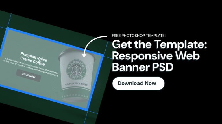
To help you get started, I’ve provided a free Photoshop template available for download. This template will assist you in structuring your own files effectively. I highlight proper sizing guidelines and safe zones areas for responsive web banners.
Additionally, I recommend using web-safe fonts and maintaining organized file structures to streamline collaboration with your development team.
- Free PSD Web Banner Template
- Google Fonts (Web Based Open Source Font Library)
Banner Resolutions & Safe Zone Areas
Above the Fold (Full Height) Banner
- File Size: 1920px x 1080px @ 72ppi
- Safe Zone: 1200px x 680px @ 72ppi
- Background Image Export: 2560px x 1440px @ 72ppi*
*best for displaying crisp, high quality imagery on high resolution devices
Hero / Slider Banner
- File Size: 1920px x 750px @ 72ppi
- Safe Zone: 1200px x 450px @72ppi
- Background Image Export: 2560px x 1000px @ 72ppi*
*best for displaying crisp, high quality imagery on high resolution devices
Best Web Practices & Responsive Tips
Photoshop File Setup
- Use RGB color profile instead of CMYK for web design.
- Set resolution to 72 pixels per inch to optimize file size for web.
- Use a baseline of resolution of 1920 pixels wide for full width banners.
- Do not rasterize text content, set up your file in non-destructive way.
- Keep all text and call to actions separate from images and backgrounds.
Font Recommendations
- Choose font sizes that are legible on both desktop and mobile.
- Choose web based fonts for site performance and speed.
- Center align text for simplicity and flexibility.
- Use live editable text whenever possible for proper HTML coding, SEO optimization, and accessibility.
Content Recommendations
- Include all copy and call to actions within the safe zone area.
- Preserve images that are not part of the background as separate layers within your Photoshop file.
- Choose background images that can be cropped in both landscape or portrait.
- Design backgrounds and elements that can work in both landscape and portrait.
Safe Zones for Web Banners
- Use guides to setup the safe zone area within your Photoshop file.
- Ensure all important content is within the designated safe zones to prevent cropping on different devices.
- Include a minimum of 300 pixels on the left and right, outside of your safe zone area on desktop. Print designers often refer to this area outside of a safe zone as a ‘bleed’.
- Include a minimum of 150 pixels on the top and bottom edge outside of your safe zone.
- If using baked-in text (not recommended), create a mobile version of the banner to ensure readability.
- Include a 30px radius around all edges of a mobile banner.
File Exporting Tips & Prepping for Web
- Keep your layers organized and labeled for easier collaboration with the development team.
- Always send the working PSD (or other design file) for flexibility in adjustments.
- Compress any exported images before uploading to improve site speed.
Ready to Start Designing?